
COLOUR THAT SELLS YOUR WORK - TOP 3 THINGS TO CONSIDER WHEN CREATING A PALETTE
When it comes to commercial art, colour is everything. You can be a creative innovator with a solid original style or an illustrative narrator with a wild imagination - but you still need a great grasp of colour to grab attention and sell your work.
We all gravitate towards different colours. You might prefer a spectrum of stormy blues. Someone else might go for rich, jewel brights or muddied natural tones.
There are no right answers when it comes to colour as our tastes are unique. But when you’re using a palette for commercial art, there are some ground rules that can help you make the most of your choices.
I’ve been putting together colours for years. Here’s what I consider when I’m creating a palette...
HARMONY
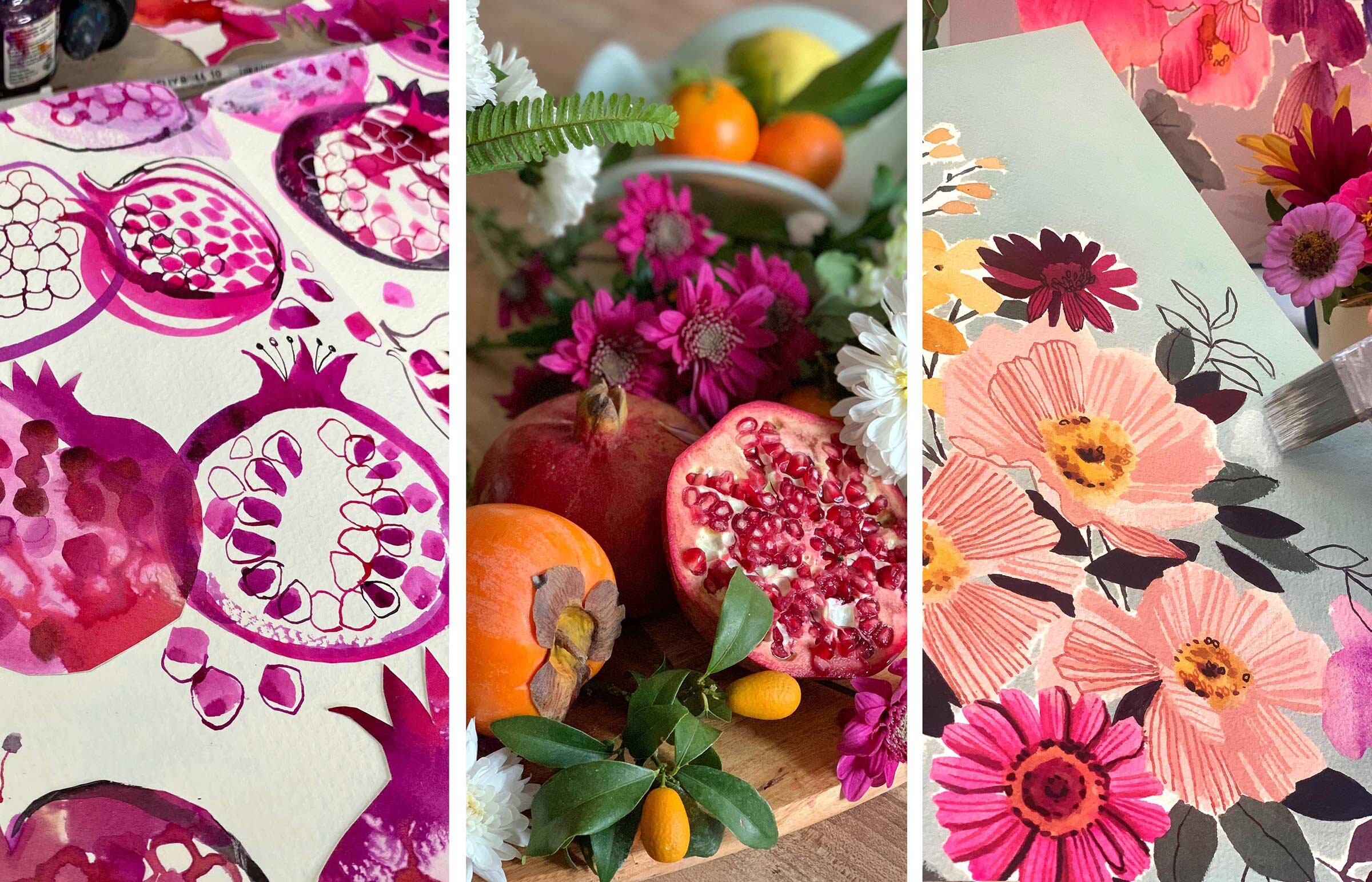
This is the easy bit - finding colours that sit well together. Most people get this - when they dress themselves, decorate the living room, wrap a gift with a matching ribbon. The obvious route to this is by selecting analogous colours (ones that are similar to each other) but most of us know a few ‘safe’ combos that look good together - navy and cream, raspberry and mint, turquoise and lime.
INTEREST
This is where it gets trickier - getting beyond the predictable, injecting an element of surprise. You can start to experiment, positioning a pale muted aqua against a deep forest green, popping a bright orange in among those slatey blues, or an acid yellow next to beige.
CONTRAST
This is the one that escapes a lot of us - and it’s heavily linked to the level of interest. Contrast pushes and pulls, creates focal points, enlivens and lifts a composition. Take a closer look at the examples I gave above. Each one illustrates how contrast/interest work together.
Pale muted aqua against deep forest green
This is route one - light against dark. If your design looks flat, this is an easy first port of call - adjusting the lightness/darkness of certain colours, making them stand out against each other. This is particularly important to bear in mind when you’re using analogous colours - you need a variety of lights, darks and midtones to create depth.
Bright orange among slatey blues
Do you know your complementary colours? Orange is the complement of blue. The two colours are on opposite sides of the colour wheel and fight against each other, pushing each other forward. If you use one against the other, you’ll create a high level of interest and contrast - especially if one is bright and the other muted (see below).
Acid yellow next to beige
This is a great way to create interest and contrast - where a neutral, muted colour is pitched against something vibrant, even neon. I use this trick a lot and love the way you can select analogous colours but make them draw attention by adjusting the saturation levels. Imagine violent slime green against a grassy one, a dusty cinnamon against a bright coral, even a crisp blue-white against warm clotted cream.

Create Collections - Registration Now Open
If you want to know more about colour and how to make it part of your signature style, while building a cohesive collection that impresses art directors, then sign up for my online course, Create Collections.
Five-week course starts Mon, Nov 1st, 2021
€197
Use code EBCC5 for an early bird discount (€180 instead of €197) until Wed, Oct 6th.
Learn more and sign up now!

Creative Fruit and Flowers Art Retreat in Italy
with Victoria Johnson and Ohn Mar Win
Le Marche, Italy, October 16-23, 2021
Last-Minute Spots Now Open
This is your invitation to join me, Victoria Johnson, and talented artist and designer, Ohn Mar Win, for a magical art retreat in Italy. Spend a week with us at the luxurious Mediterranean Oliveto Estate overlooking the Adriatic Sea. Surrounded by natural beauty and inspiration, we’ll relax, get to know each other and paint together. Come and join us!


Free Gift
Just for you! I’ve created 12 original, custom palettes for you to use, however you want. They’re based on my floral paintings and you’ll get one a month for an entire year. All you have to do is sign up for my newsletter to get them delivered to your inbox. Give them a try and see if my tips and tricks work!

